| Revista Umělec 2002/3 >> Gateway to Postmodern Purgatory | Lista de todas las ediciones | ||||||||||||
|
|||||||||||||
Gateway to Postmodern PurgatoryRevista Umělec 2002/301.03.2002 Ivan Mečl | Perfil | en cs |
|||||||||||||
|
How she drove my car and more
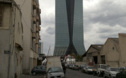
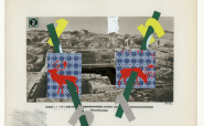
I finally met Štěpánka Šimlová for the first time in Gallery MXM this year — one evening before I was to set off for France. The week prior I had been asking around for a traveling companion and by that night I’d given up all hope of finding someone. These days, people no longer make up their minds on the spot, so I was half joking when I asked her if she wanted to come along. Looking excited, she agreed immediately, saying I could pick her up the next morning. As we’d never spent much time together, only a few openings and parties here and there, this seemed to me a brave act. Sometimes I had the impression that she avoided people, but this was my mistake. Štěpánka doesn’t take much with her when traveling. Maybe this was because I couldn’t tell her when we’d be back. I’d always thought of myself as a fast driver, but that was before I let Štěpánka drive. I was only able to catch some sleep after I’d completely collapsed in exhaustion from watching her gun the car furiously down the road. Sometimes I caught myself shouting out: “Look, it says 60” (we drove 190), or “Jesus, truck!” (as we swerved around a truck and nipped in front of it just in time). Shame on me. On our way back to Prague I learned that she had a passion for motorcycles and race cars. She said that the Harley she’d once ridden was too slow. Štěpánka doesn’t just start talking about art on her own. With great difficulty we finally began talking about her work. I had no idea then that I would be writing this article, but I did know she was going to make an appearance in Umělec one day. She doesn’t like interpreting her work, but she doesn’t mind discussing how it comes about, and she certainly doesn’t deny the fact that she knows exactly what she’s doing. Her work is seldom the result of chance or play. She knows what she wants to say, but she wouldn’t tell you that. She might only say, “I liked doing it this way…” And that would be it. No interpretation of dreams, mystical experiences and artistic combinations, although you might have expected that. Drawings and Graffiti Freestyle… One could say that Štěpánka’s drawings are Pop art. However her style stems from 1980s Eastern European advertising graphics. Their contour is not thick and smooth but slightly academic, and Pop is reflected in the stylized faces. Poptimism, if you will. Cool style that doesn’t provoke but is pure message. At first I didn’t quite know what to make of her “graffiti.” This always happens with things I end up liking the best. I had to discover them for myself, as the purist of things: ordinary and seemingly familiar situations sprayed using stencils on white plastic canvases. Using stylized stencil marks as the basis — painted over with free sweeps of spray paint — makes them some of her most liberated expressions. Spraying is currently a tempting technique for artists. Unfortunately most end up breaking their teeth on it. Spraying readily betrays its self-serving nature with unintentionally sloppy technique, as well as outright seemingly good technique. It forces you to do something, to act, and when you put up a lot of resistance you wind up treating it as if it were brush and pencil. Štěpánka has accomplished the technique, but she has since moved on. Her more intuitive goal was to master technology. Soulful and Spiritual Reality Štěpánka never wanted to change reality. And virtual reality was never her intention. Even if she were capable of creating perfect illusion from technology she wouldn’t make use of it. Her interference must be visible. Although the result seemingly approaches that of illusion and her detailed computer work is evident, there’s always something a bit off, something different from what should be. The total work has a different perspective, an artlessly inserted element or forgotten detail and the intentional mistake is part of her expression. In combination with the represented scene it can look like an illustration from a manifesto of avantgarde ideology, which is so rare nowadays. She first makes scenes by repeating several landscape motifs. The imprints of elements in rows or in mirror opposition — though very evident — feel natural. When we look at them we desire them rather than find their existence permissible. Her wish to create an altruist city reminds us even more of metropolitan panoramas, whose neon lights address inhabitants with placid appeals and flashes of seemingly illogical acts. We’ve always longed for something different. Change the world? Private Collection The worst word you can use in describing a work of art is the adjective “disturbing.” Critics employ it when viewers feel that everything is in place, in harmony and beauty but… oh damn… what’s that thing over there in the corner? And what’s with the color? The word works as a crutch when we cannot comprehend a symbol or the story behind an image. But it’s no good at all wanting to understand everything. Magazines targeting bright minds have since the beginning of time run the example of two very similar images of whatever side by side, with just a slight alteration or missing element missing in one of them. It’s sort of a tradition now: He who finds all the differences wins. It could be said that tradition is merely the repetition of heroic acts, generation after generation. Isn’t there a dash of magic in that, in the mundane life of the lover of the crossword puzzle? My advice is find your own superhuman act and repeat it until you too become a figure standing somewhere between the artist and the image. When you act — even futilely — the act itself will become more perfect than repetition, and you will have become a represented being. Initiation Dances The duty of contemporary art is to destroy the viewer, or at the very least the viewer’s essence. Interactivity and performance over the past few decades have drawn the viewer into art, but it turns out that this approach is forced and the viewer still resists. In most cases the effort to persuade the viewer that this is also his or her world fails. The viewer finds the represented strange or alien and cannot find within it even a shred of personal banality, that little something remarkable. When familiar exteriors such as traffic jams or a city at night become art, the viewer is willing to be occupied by the philosophical messages of guideposts, arrows, billboards and neon lights. So the viewer becomes the driver in the photographed car and ceases to be perpetually hunted by art. How simple, you might think. True, how simple and yet not stupid, I believe, and that’s the way it should be. In fact, it’s advertising. That people turn the channel when commercials come on is just wishful thinking by intellectual talk show hosts. The illusion of happiness packed into an ephemeral moment is like a drug. It is so perfect that you often don’t see the product and you don’t have to beg for it at the newsstand in the morning. You just want to see it over and over again. Happy men drinking beer followed by women with Bailey’s and Metaxa, beaming kids wearing clean clothes eating the best food and playing with frolicking pets for which man has created Kitekat and Whiskas. Try replaying an entire commercial break in your mind. Isn’t it a vision of paradise? If only we could live there in that picturesque country of our grandmothers, taking walks with the family, cookies in our pockets, knowing that all human lives and everything around us worth a damn are insured by Allianz. Wake up! Where’s the sacred in all of this? There’s no Jesus and Virgin Mary in the mix. Miracles are made only by washing machines and refrigerators, which make for false prophets. Just a few steps from this sweet illusion, a few well-intended pieces of advice and self-reflective prompts, and we’re in purgatory. It is a purgatory created by the transcendental advertising agency, which doesn’t torture the body. In an environment of civilized scenery and in the presence of musical heroes it creates ripples of danger in the pacified psyche of the Euro-American. It is like his city, a highway familiar to him from traveling to and from work, and this man can almost recall the names of the musical actors and the performances they have appeared in. But this is a different place, and yet the man wishes to be there, so that someday it may happen. Tokyo, 2000, digital montage, c-print History Ends Every Second, 2000, digital montage, c-print Maddonas, 2001, digital montage, c-print Landscape, 1999, digital montage, c-print Landscape, 1999, digital montage, c-print Private Collection, 2001, digital montage, c-print
01.03.2002
Artículos recomendados
|
|||||||||||||


Comentarios
Actualmente no hay comentariosAgregar nuevo comentario